Introducing Happyfeed 2.0
One of our biggest updates and redesigns since launching in 2013

Last week we released one of our biggest updates to the Happyfeed App. We rewrote the code on most of our pages and added a few big features to make it even more fun to use.

Focus on the journal
The more you use Happyfeed, the more happy moments you are collecting. We want to make scrolling, tapping, swiping, and zooming through these moments an absolute joy. There’s something incredibly powerful about having a journal full of only your happiest moments, and in this version of Happyfeed, we really wanted to make that our focus.
The Homepage
You might not see any major differences on the new homepage. That’s because posting on Happyfeed has always been our simplest and best feature. We wanted to improve the look without losing any ease-of-use.
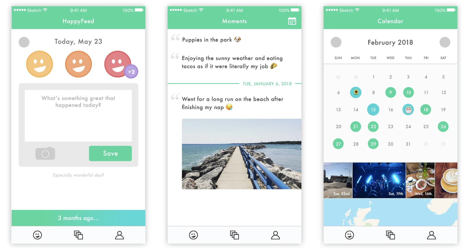
The first thing you might notice is the new navigation bar on the bottom. We threw out the old green (too much green!) and updated the icons to be more appropriate for each page.

Additionally, we updated the “1 month ago…” button look, improved the spacing a little, and added little dots to make it easier to know which day you’re on. And if you’ve been using the “Especially wonderful day?” button, you’ll notice we updated that as well.
Past Moments
Since we are introducing a calendar for Plus subscribers, we thought we better make some big changes to the history view as well. The main goals were to make it cleaner, clearer, and more fun to scroll through.
Looking through your past moments is one of the most fun parts of using Happyfeed
- 🗂 Grouping by Day - Each day is now separated by a green line and text. This saves space by not repeating dates and makes it easier to see which moments go together.
- ✨ Image loading - All the images throughout the app now load in with a fade effect. It makes scrolling feel smoother and much more pleasant.
- 📐 Text sizing: We added a little spacing and now use a bigger font for short posts. If you just want to post the name of your boyfriend or girlfriend, we want that to pop out just as much as a snapshot of the ocean.
- 👆 Tap to scroll up - You might expect this from other apps, and now you can tap the history tab icon to automatically scroll to the top. (It’s the little things, right?)
After posting on Happyfeed for even a week, looking through your past moments is one of the most fun parts of the app. We hope that feels even better with these changes!
Your “Magic” Calendar
The calendar is by far the most complicated addition we’ve made to Happyfeed in a long time. It’s the first time we’ve explored using location data and new ways to think about your past posts in the app.
- 🗓 Overview - The new “magic” calendar shows all your days on a familiar calendar interface. The days you tag as special will be immediately obvious, and you can tap on any day to quickly see those moments
- 🏞 Preview images - Each time you load a month, we’ll pull up a set of sample images. Images are a powerful way to remember your month without needing to tap through the days
- 📍 Map view - Below the image slider, we (finally) added a map of your moments. Location tracking has been an optional feature for a long time, and now you can actually see where you were when you posted your happy moments.
- 👀 Focus on exploration - If you wanted to see a post from last March, it would require a LOT of scrolling before. Now you can just tap on the month title and select the month you want to look at. It’s quick, easy, and gives you all the control.
The calendar is only available to Plus subscribers. We built it specifically to make the monthly subscription more worthwhile. If you get the chance to check it out, we think you’ll absolutely agree 😊
Subscriptions
We’ve been pondering paid versions of Happyfeed for years. Mostly - how can we generate revenue to cover our costs and grow our team without sacrificing any of the happiness created by our app? We decided it was important that the free version of Happyfeed will always be available and will never lose any features.
So, we called the subscription “Plus” because it’s just the same version of Happyfeed but with extra features to make the experience even better. Some of these features make it more expensive to run our company (server costs, etc) so it felt natural to ask for a small monthly fee.
Subscriptions allow us to avoid advertisements, expensive partnerships, and silly ventures
Most importantly, subscriptions allow us to avoid advertisements, expensive partnerships, and silly ventures like “Happyfeed for business.” We might even be able to hire on some talented designers to make a few new “end-of-day” images! (That’s secretly all we want.)
We’d really love it if you try out the Plus version of Happyfeed! You can learn a bit more about it on the profile page of the app or by reading our FAQ
Moving Forward
Not only did we polish up the face of Happyfeed, but we rewrote most of the application code to make it easier for us to add new features and make updates in the future. We’re building the infrastructure for something we hope to use ourselves in 30 or 50 years from now, and it’s important we do that right.
What about features?
We can’t say exactly when or what order you can expect these in, but in the next few months we’re most excited to work on:
- Adding locations by name (like that new restaurant or hiking spot) to your moments
- More map integrations (for Free and Plus versions)
- Offline posting
- Long-form journal posts
- And a few surprises we don’t want to spoil quite yet... 😛
Thank you!
Thanks for reading and thank you for supporting us even if just by trying out the app! We can't wait to share even more updates soon.
